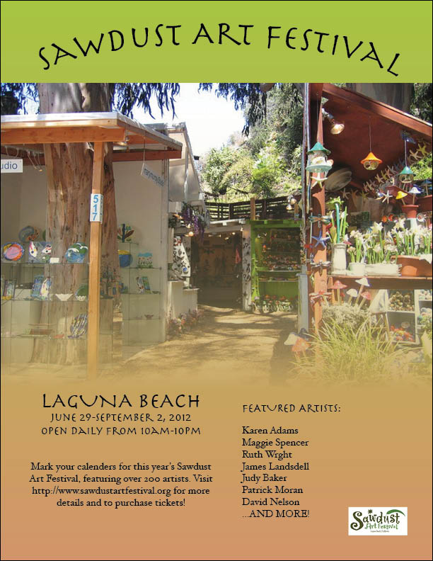
I chose each aspect of my flyer specifically to appeal to the audience of the Art
Festival. First of all, the picture I chose highlights two important parts of the
festival: it's outside and it is art-based. There is artwork shown in the picture,
and the natural landscape is also shown. In addition, I chose the two colors that would
emphasize the organic aspect of the festival. The festival takes place outside in the
summer in beautiful Laguna Beach. So, one of the main selling points for potential
festival-goers is the atmosphere of the festival. Also, the green stands out against
the brown and white. I think it's a nice way to make use of color, without it looking
chaotic.
I also put a lot of thought into my use of text. I chose a cool font, which looks both
artsy and natural. I like that it is all capitals, so it really stands out. I also used
simple font, so that I added some variety. However, I only used those two fonts so that
the audience could see repetition and uniformity. The information I included was the basic
information that one would need when inquiring about the festival. I think that art
festival-goers would appreciate less text and more focus on the artistic aspects of the
flyer, so that is what I did. I also included the festival's logo, so that the organization
itself could be easily identified. This eliminates any confusion about multiple festivals.
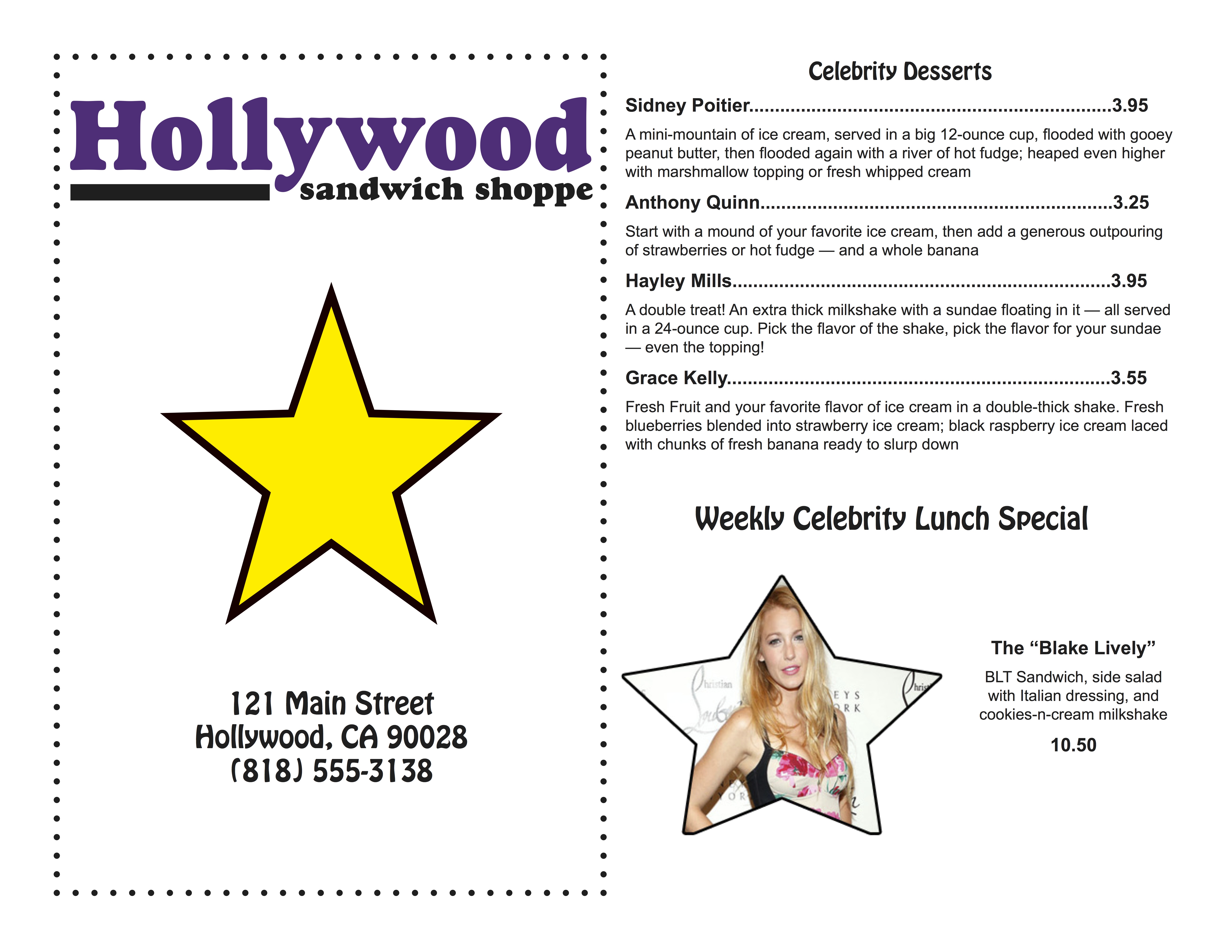
For this project, I really focused on the "Hollywood" theme. I kept it simple and clean.
The front cover of the menu simply has the logo, the address, and a star to represent the
menu's theme. I also added a border on the front menu. Even though the border is not on the
rest of the menu, I think it looks good. It would have been too distracting on the other pages.
I kept the menu to only two colors. The star is actually yellow, and this contrast would look
good whether it is in color or black and white. The restaurant said they would prefer to use
black and white, so I focused the design around that idea. The use of yellow seemed to be a
good choice for a black and white design.
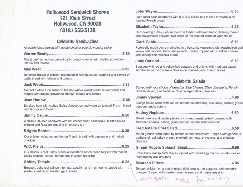
The actual menu items inside are all consistent. I used paragraph styles to create the
headlines, menu items, and descriptions. The font I used for the headlines compliments the
restaurant's logo. They definitely go well together, without competing for attention. I made
the descriptions of each item a little smaller, and I chose a font that goes well with the
other fonts. The menu uses Hobo std (in the headlines and address) and ariel. These two fonts
both go with the logo, as I mentioned before. My strategic use of font emphasizes repetition
and consistency. I created a lunch special named after the star of "Gossip Girl," Blake Lively.
I put her picture in the shape of a star via photoshop to represent the Hollywood theme once again.
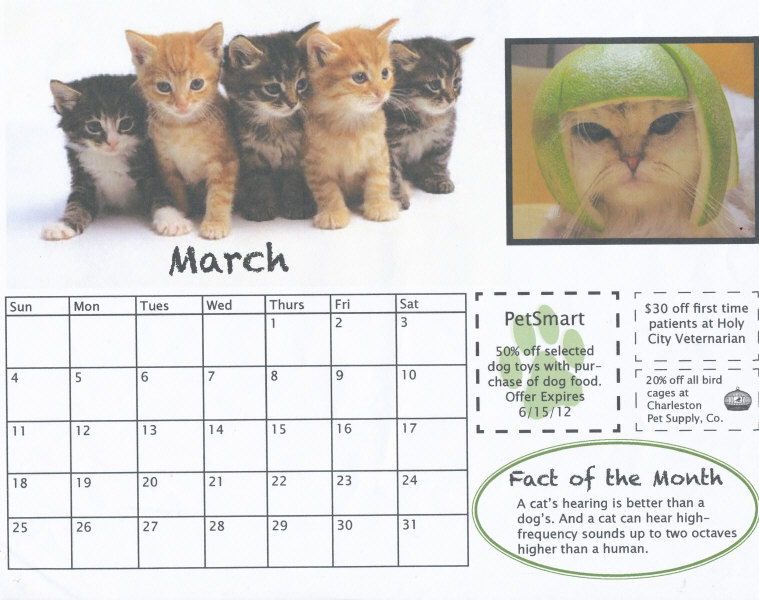
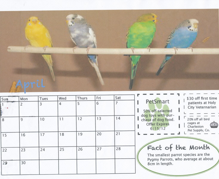
I used some specific styles and fonts for this project to convey a particular calendar that the
Humane Society would like. First, I used three large images across the top of each page. I chose to
makethe images so large and at the top because animals are the main priority. They should be thought
of first. I though the Humane Society would appreciate that the animals are the main focal point.
Next, I kept the color scheme very simple. I kept it mostly black and white with one or two accent
colors. Green is incorporated in each month--on the coupon and the fact of the month--to create some
consistency and repetition. The coupons were simple, however, I think it's easier to read when they
are simple. Overall, I think the colors and styles are cohesive and fun.
If you have any further questions, feel free to email me at: erw561@gmail.com